2025
Counter Culture Coffee Rebrand
Counter Culture Coffee is a pioneering specialty coffee roaster known for its commitment to sustainability, education, and quality. This redesign aims to create a more unified and purpose-driven brand system—one that visually communicates Counter Culture’s dedication to ethical sourcing, environmental responsibility, and community-building. Through thoughtful design, the goal is to enhance brand recognition and better connect with both loyal customers and new audiences.

Primary Logo
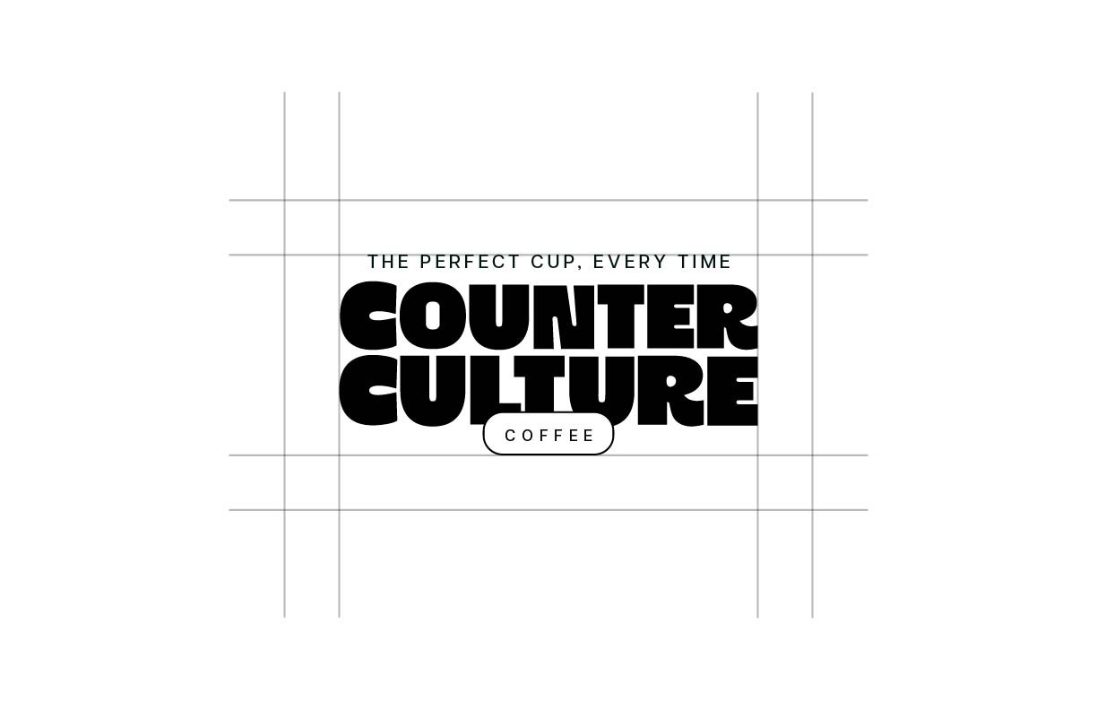
This redesigned Counter Culture Coffee logo embraces a bold, modern aesthetic while maintaining a sense of warmth and approachability. The heavy, rounded letterforms exude strength and confidence, reflecting the brand’s commitment to quality and sustainability. The contrast between the solid typography and the delicate oval enclosing "COFFEE" adds a refined touch, reinforcing attention to craft and detail. The tagline, "The Perfect Cup, Every Time," positioned above, speaks to the brand's dedication to consistency and excellence. With a balanced grid structure and thoughtful spacing, this logo establishes a fresh yet timeless identity, capturing Counter Culture Coffee’s progressive yet community-driven spirit.